hello(at)acdesign.io
acdesign & strategy © 2025

menu
close
Itaú Cultural is an organization dedicated to research, content production, and mapping, encouraging and disseminating artistic-intellectual manifestations.
COMPANY:
Itaú Unibanco
ROLE:
Lead Designer
WEBSITE:
http://www.itaucultural.org.br
Decoloniality Metrics:
Culturally-informed • Latinx design
Itaú Cultural is an organization dedicated to research, content production, and mapping, encouraging and disseminating artistic-intellectual manifestations. The institution is committed to Brazilian culture's preservation, promotion, and development, representing a bridge between the financial sector and the arts.
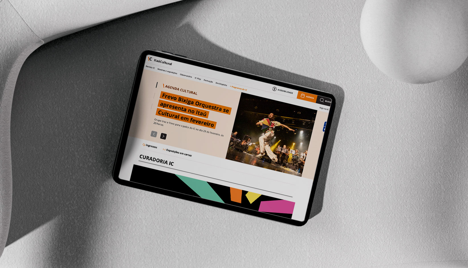
This way, the organization contributes to the appreciation of the culture of a society as complex and heterogeneous as the Brazilian one. Itaú Cultural is a non-profit cultural institute owned by the Latin American private bank Itaú Unibanco. The project involved redesigning the organization's visual identity due to the need for a more flexible system and the deployment to the digital environment.

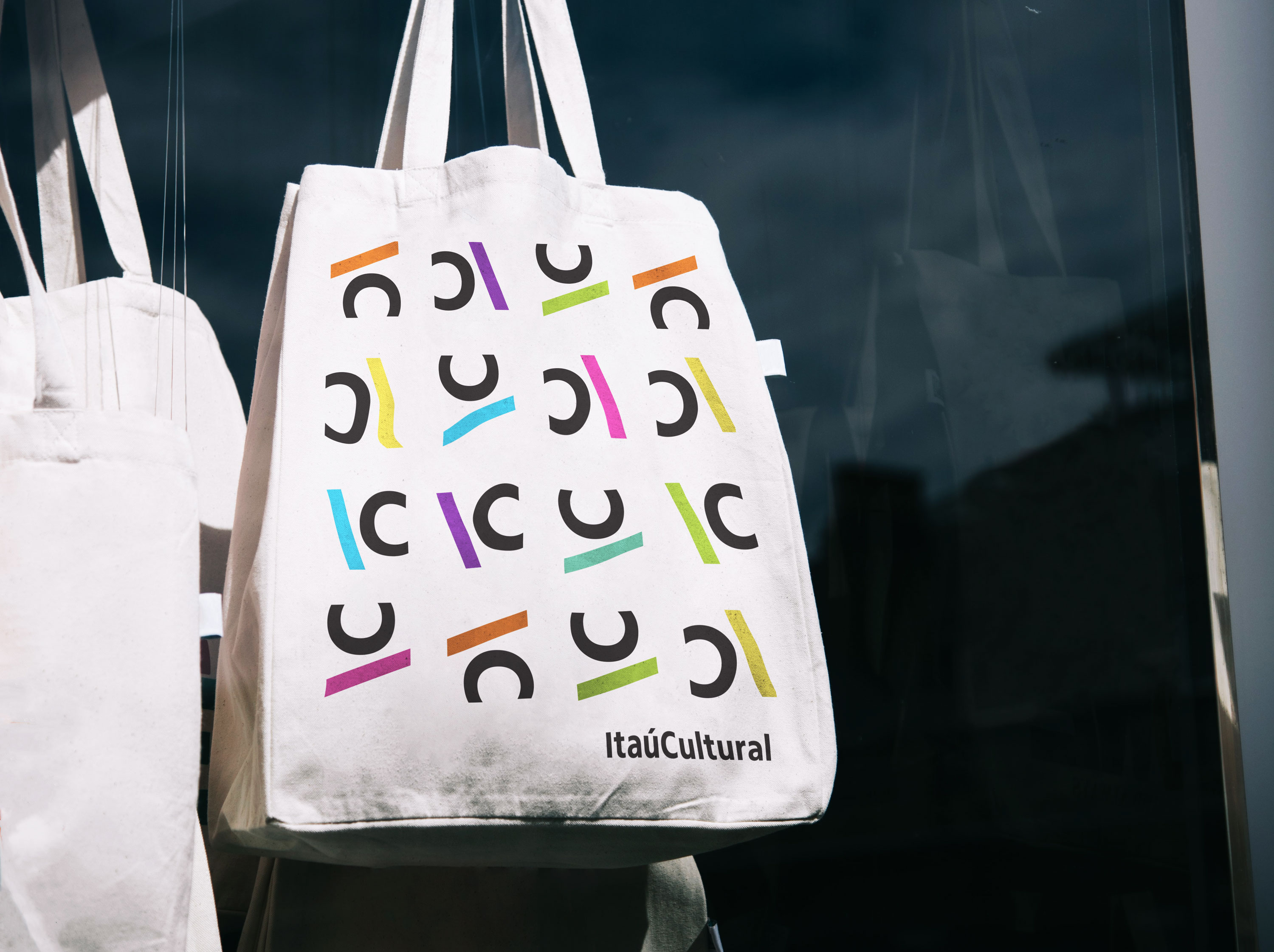
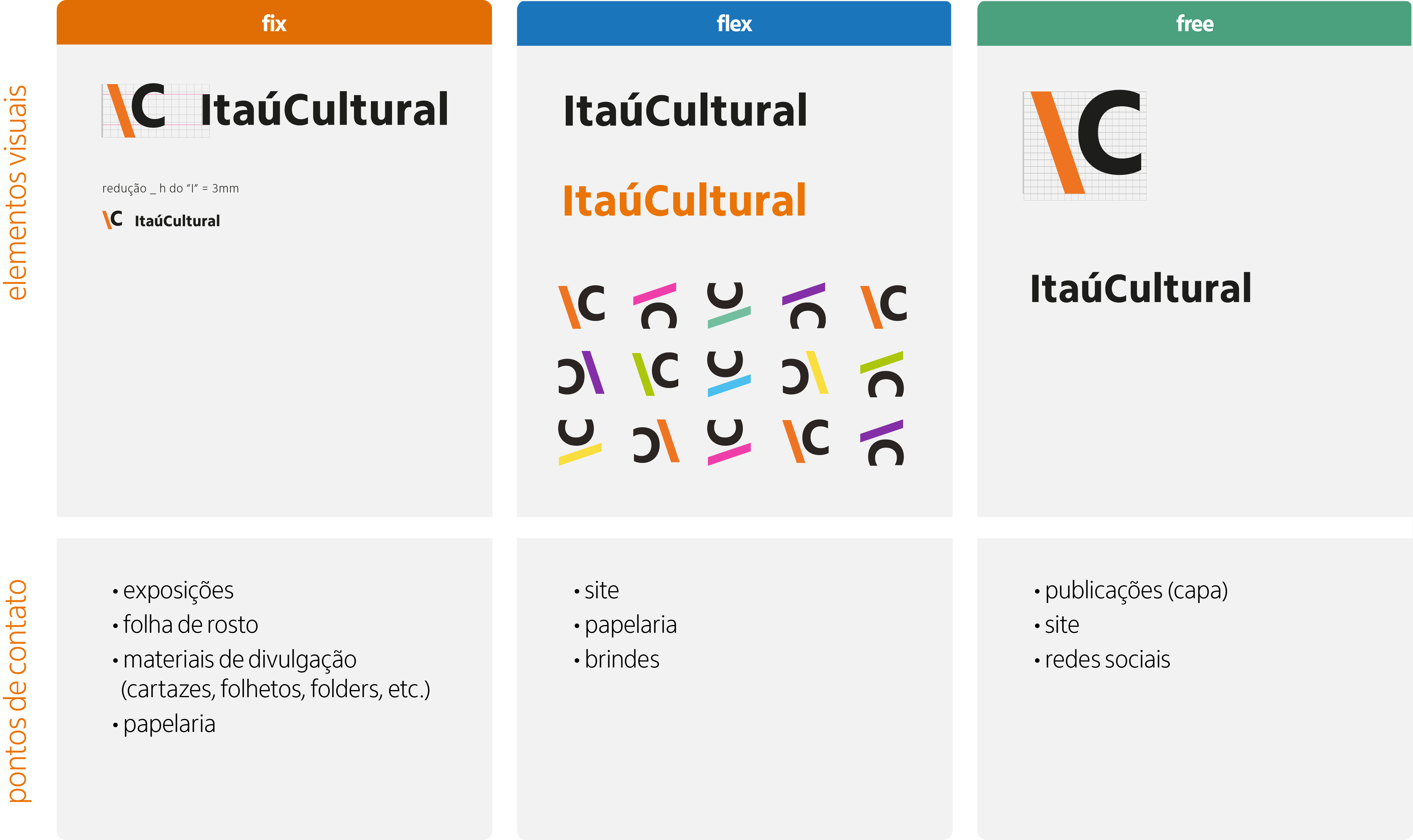
Starting with the visual identity system, the logo contains a slanted line to the left inspired by a backslash in combination with the letter C, representing the word cultural. The character placement makes playful interpretation possible, such as suggesting the correlation between the line and the letter i in Itaú. It also symbolizes digital environments that oftentimes use the slash “/” and backslash “\” in URLs.
The slanted line itself is versatile, and it works in different directions. It also works as a graphic, a pattern, a single visual element, or in conjunction with the C from the name Itaú Cultural. Besides, the position of the backslash-like character and the letter C creates a triangle formed by counter space.
Since 2018, there have been many changes in the organization. Despite that, the visual identity and its flexibility and versatility have kept up with the organization's technological changes and innovations. The redesigned visual identity achieved the goal of being aligned with the attributes of Itaú Cultural (solid, digital, plural), bringing the audience closer to the institute and building graphics that continue to be relevant despite the passing of time and changes.

The chosen colour palette refers to the seven categories encompassed by the organization, respectively: yellow - public engagement; purple - dance; pink - theater; aqua green literature; lime green - audiovisual; blue - visual arts, and orange, which is the colour of the organization.
Besides the colours demarcating the categories, the bold and fun shades refer to diversity in the arts and the inviting, free access to the cultural institution. Since Itaú Cultural supports and provides grants to contemporary artists, the choice of bold, bright hues also reflects the goal of the organization to help experimental, ludic art and diverse cultural projects thrive.


The need for describing the level of flexibility of the visual identity came from requirements of the project due to editorial (books) and online platform needs (social networks, website). This system allows a multitude of combinations between its elements such as icon, wordmark, and patterns. For instance, the wordmark consists of the name of the institute in its original font, in black or orange.
Additionally, separating the icon and wordmark makes using these elements independently possible, for example, in the case of physical books, the logo's icon could appear on the book cover and the wordmark on the book spine. However, the logo elements and the pattern can also be integrated, for example in a tote bag, stationary, and other collateral pieces.