hello(at)acdesign.io
acdesign & strategy © 2025

menu
close
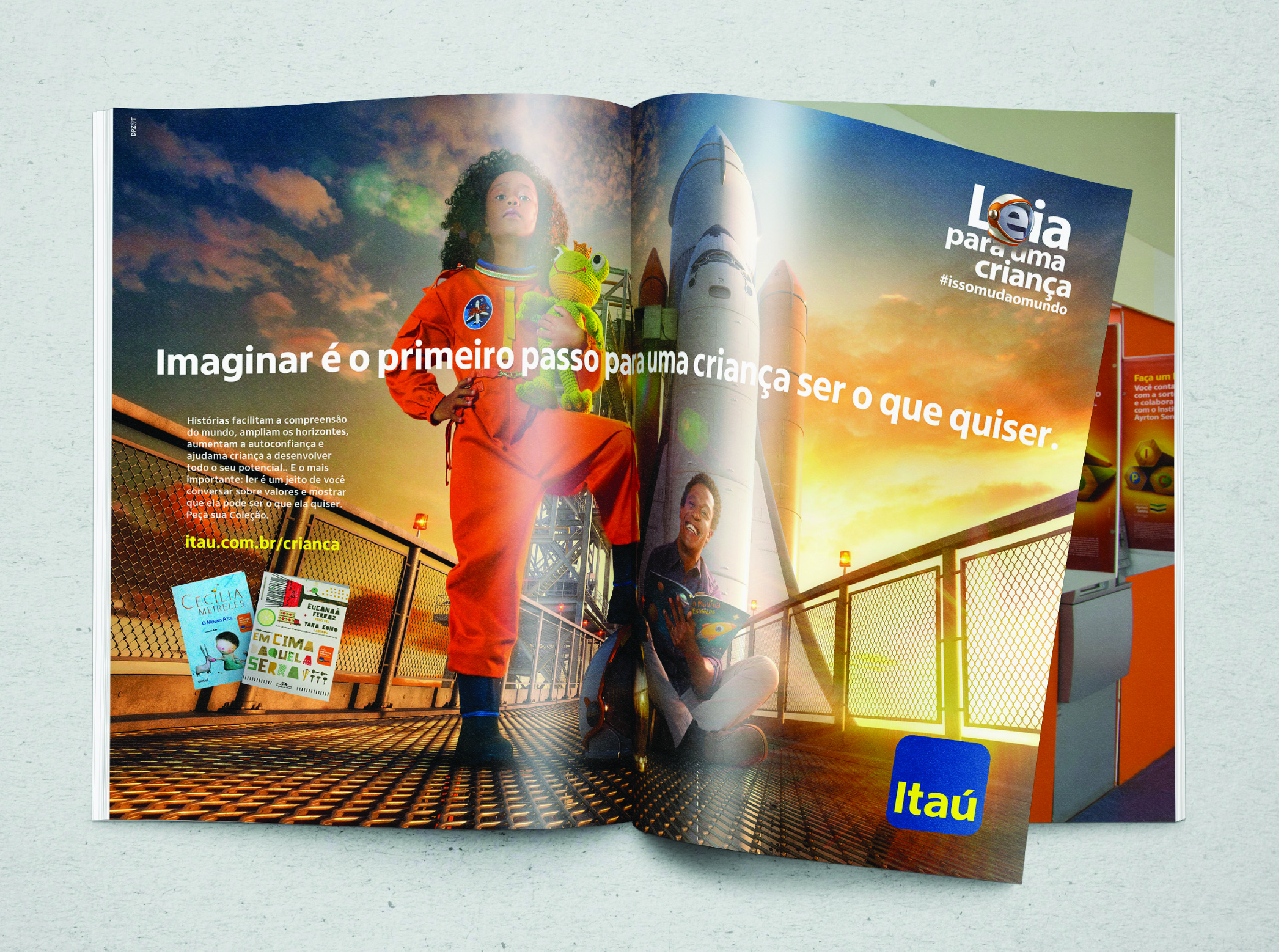
The Itaú Typeface is a custom Latinx font family created in collaboration with Dalton Maag for South America's largest bank.
COMPANY:
Itaú Unibanco
ROLE:
Lead Designer
WEBSITE:
https://www.itau.com.br
Decoloniality Metrics:
Accessibility • Latinx design

The Itaú typeface is a humanist sans-serif designed to create a sense of proximity and engagement through its open, dynamic forms. Crafted for optimal legibility and performance, it excels in digital apps and small text sizes. Exclusively created for Itaú Unibanco, the typeface reflects the company's core attributes—lightness, simplicity, and accessibility. It comes in two versions: Itaú Display, with six weights for print and media, and Itaú Text, with four weights tailored for digital use. The fonts are optimized for clarity in smaller sizes, featuring wider letter spacing, a higher x-height, and distinct letter shapes to enhance legibility.

The Itaú typeface is a humanist sans serif, it invites the eyes to go across its open and dynamic forms, creating closeness to the user. The shapes were drawn to bring lightness and performance to digital apps and excellent legibility for smaller text sizes.
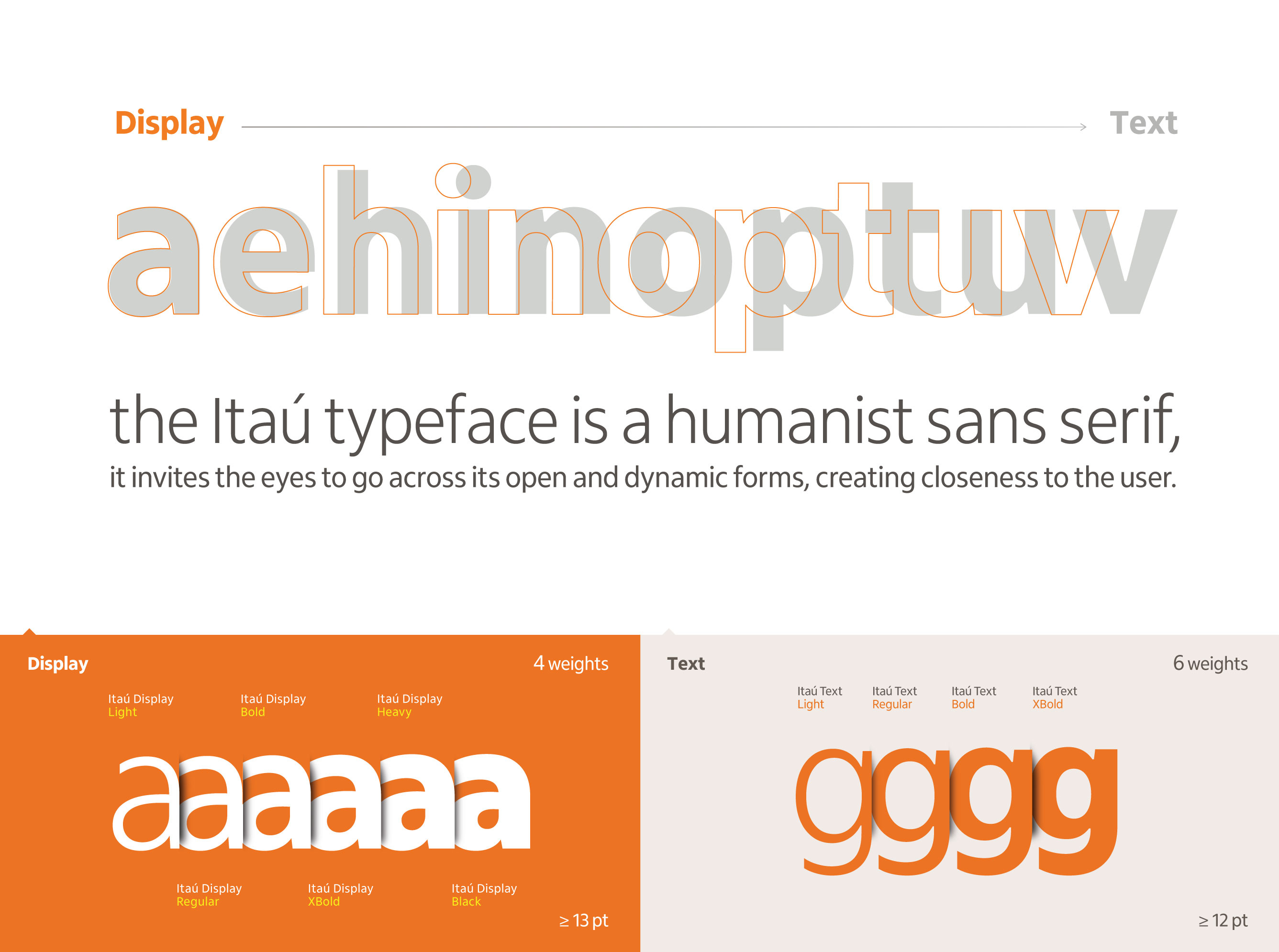
The font family consists of two versions: Itaú Display and Itaú Text.
Itaú DIsplay has six different weights for print design, presentations, and media that include medium to large text sizes. Itaú Text has 4 weights and is especially recommended for digital applications. The fonts are optimized to increase legibility when used at smaller text sizes due to greater space between the letters, greater x-height, and different letter shapes.
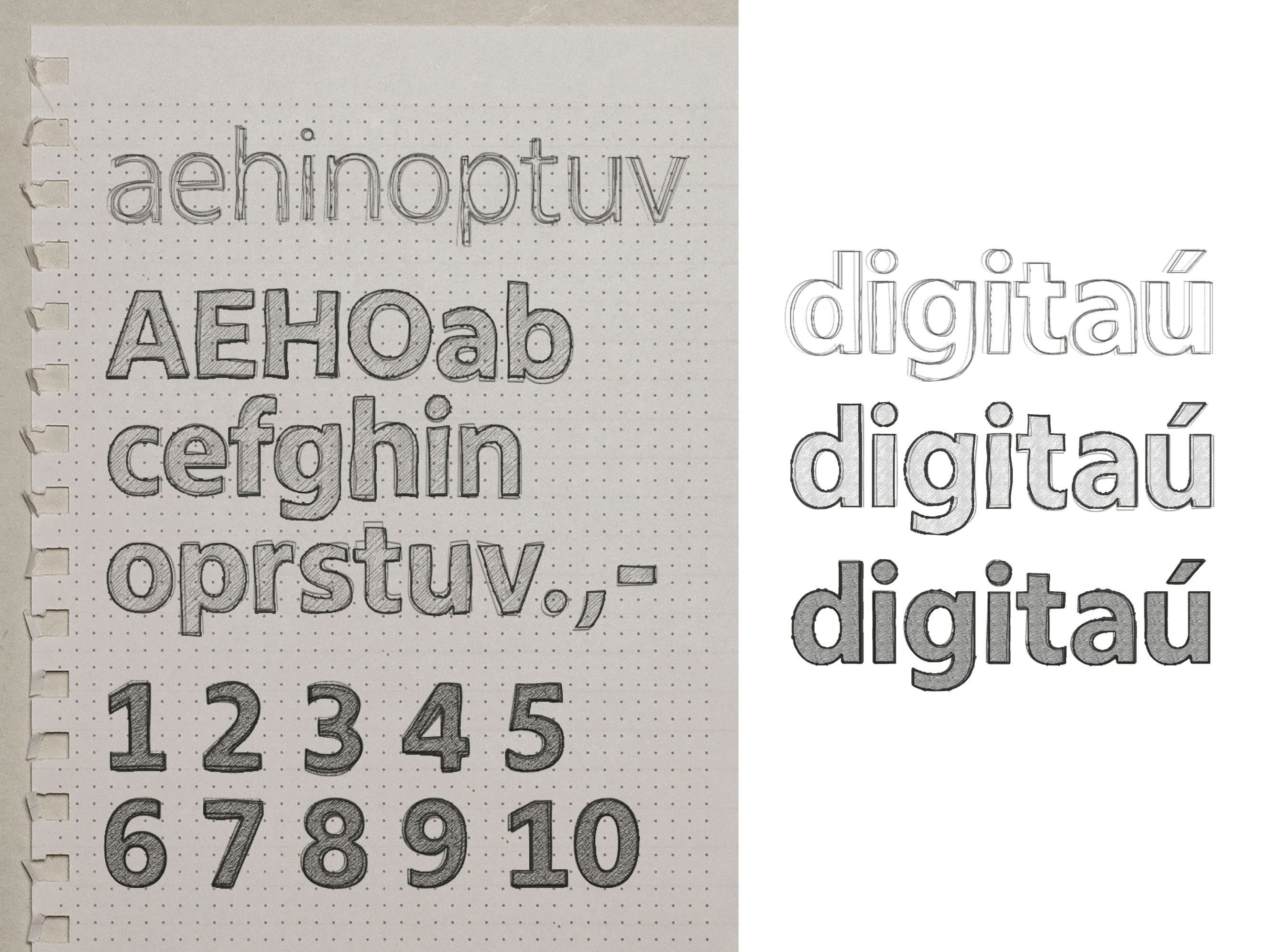
Dalton Maag team. This iterative process included biweekly reviews of new font characters, with stages covering ideation, design concepts, refinement, ASCII development, full set creation, weight adjustment, kerning, design QA, hinting, engineering, and final font release. A global team of over 30 people from 10 different nationalities produced approximately 154 typeface files!
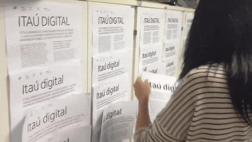
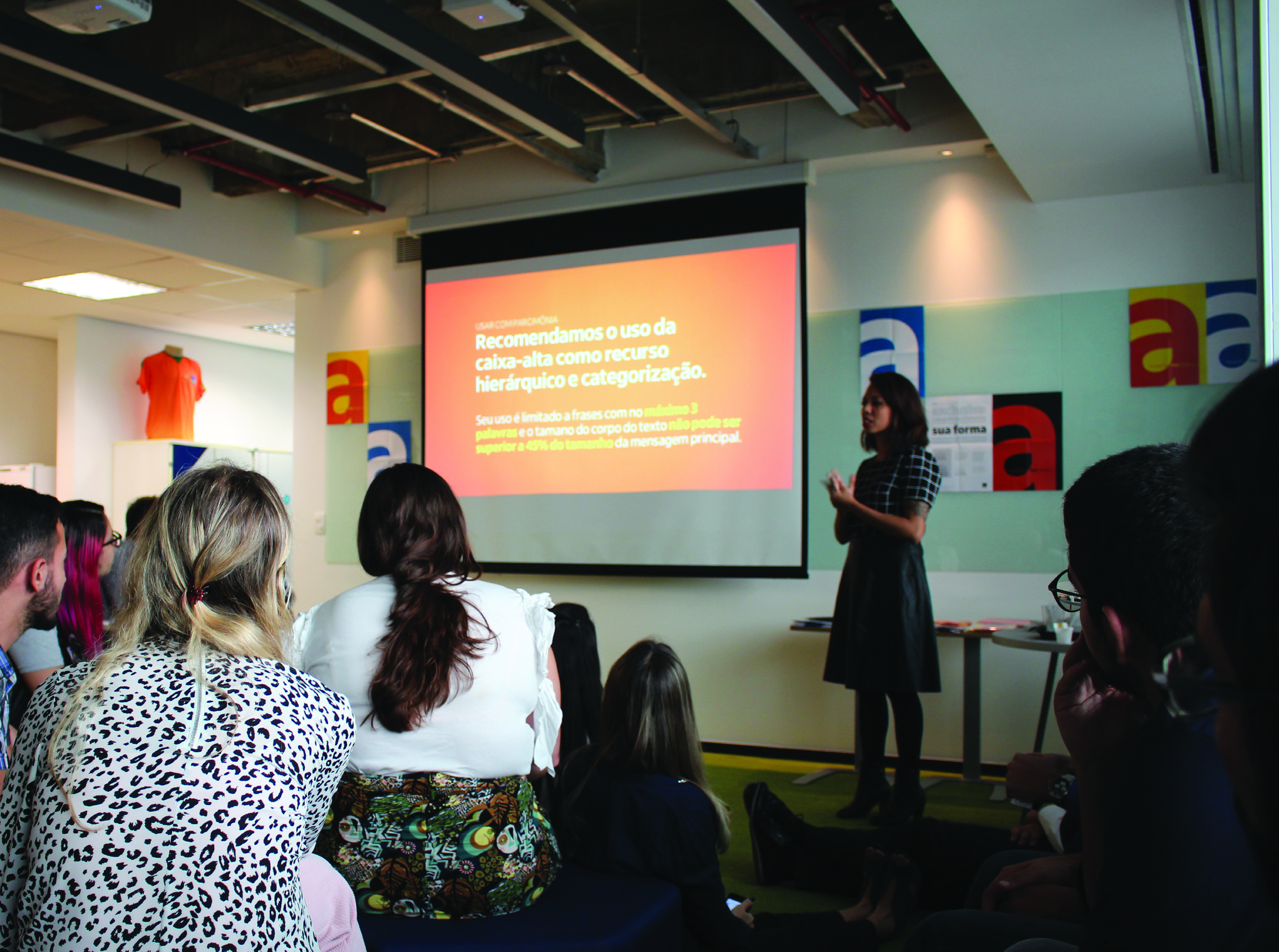
As the lead designer, I worked closely with Dalton Maag throughout the project, managing the review and approval processes and coordinating the distribution of the font to over 50,000 employees in 2018. I also oversaw the promotional efforts, including email marketing, the art direction of the promotional video (below), and the submission of the project to design awards.
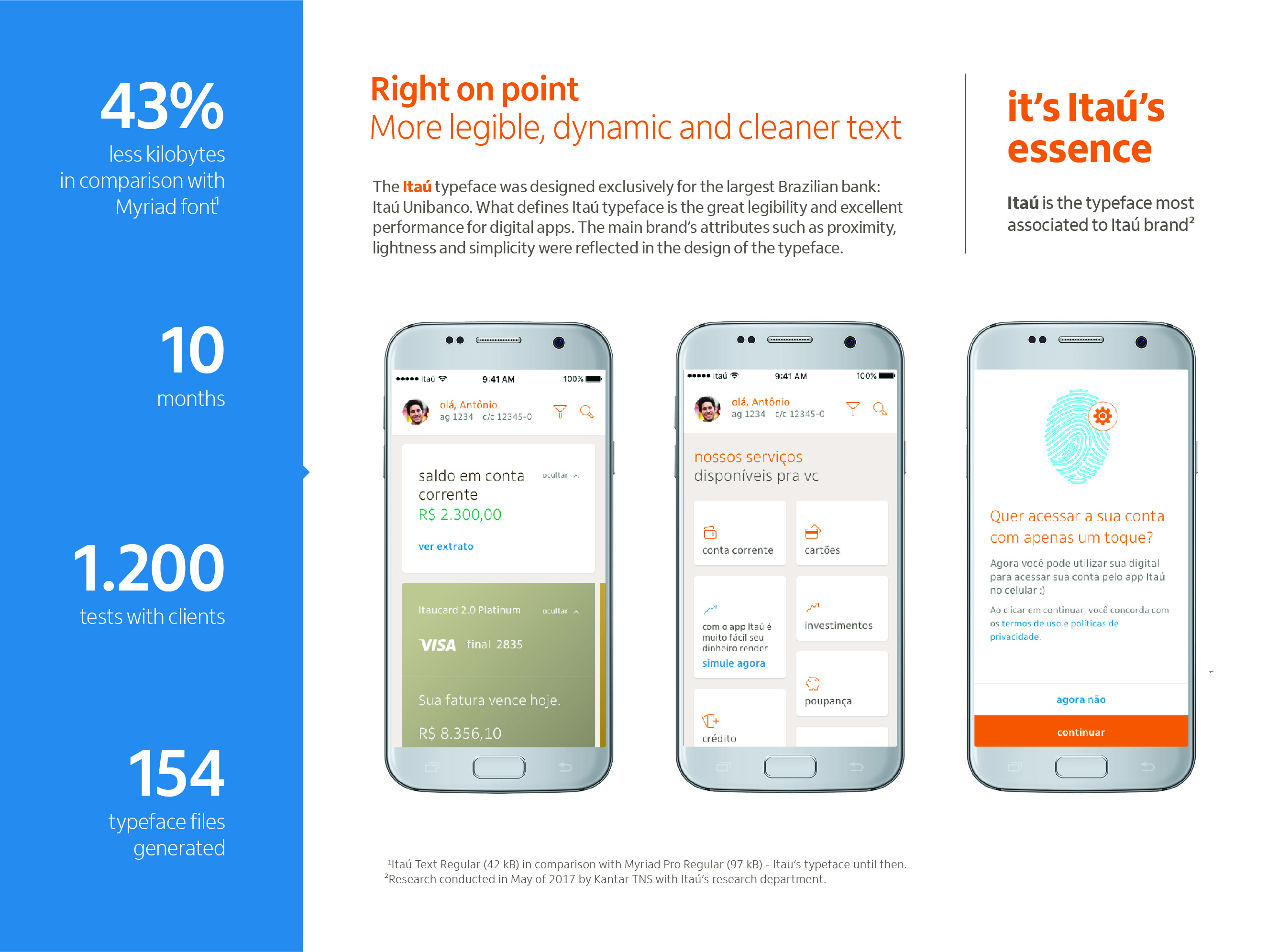
The Itaú typeface underwent a cutting-edge research and testing process, led by Kantar TNS in collaboration with the internal team. The study included both qualitative and quantitative phases: a semiotic analysis and an online survey designed to assess the Itaú typeface's alignment with the brand’s attributes and its legibility. The semiotic research focused on interpreting the visual and cultural meanings of the typeface, enabling fine-tuning of its design. When tested against San Francisco, Roboto, and Myriad, the Itaú typeface was found to be the most strongly associated with the Itaú brand, according to a survey of 1,200 clients.