hello(at)acdesign.io
acdesign & strategy © 2025

menu
close
Santo Legume is a Brazilian plant-based business and recipe blog focused on "eating well" with seasonal, organic ingredients from the owner's garden and local producers.
COMPANY:
santo legume
ROLE:
Creative Director
WEBSITE:
https://www.santolegume.com.br
Decoloniality Metrics:
Small local business • Plant-Based • Female-led • Eco-friendly • Latinx design
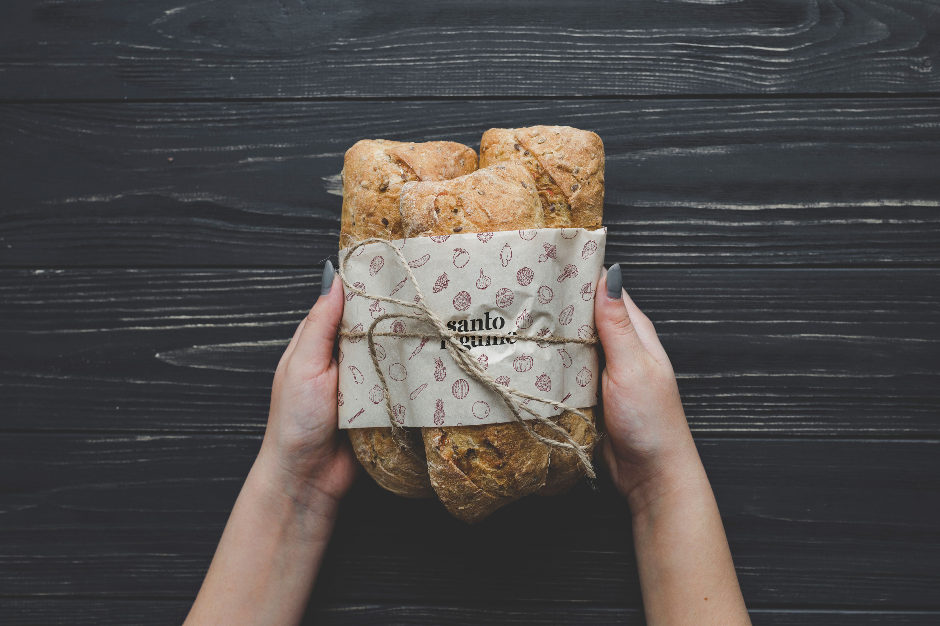
Santo Legume is a Brazilian plant-based small business and recipes blog. Each ingredient of the delicious fermented preserves, banana breads and jellies is handpicked and seasonally chosen from their garden or sourced from small local producers.
Fresh, sustainable, organic, earthy, plant-based, affective, authentic translates Santo Legume's philosophy of "comer bem" or, in English, "eating well." The business owner's personal relationship with food, coming from a long lineage of women who cooked dishes that were - in the owner’s words - pure art, deeply influenced the inherited love and dedication passed onto Santo Legume’s products.
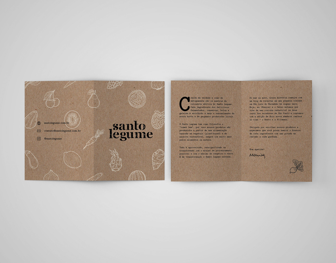
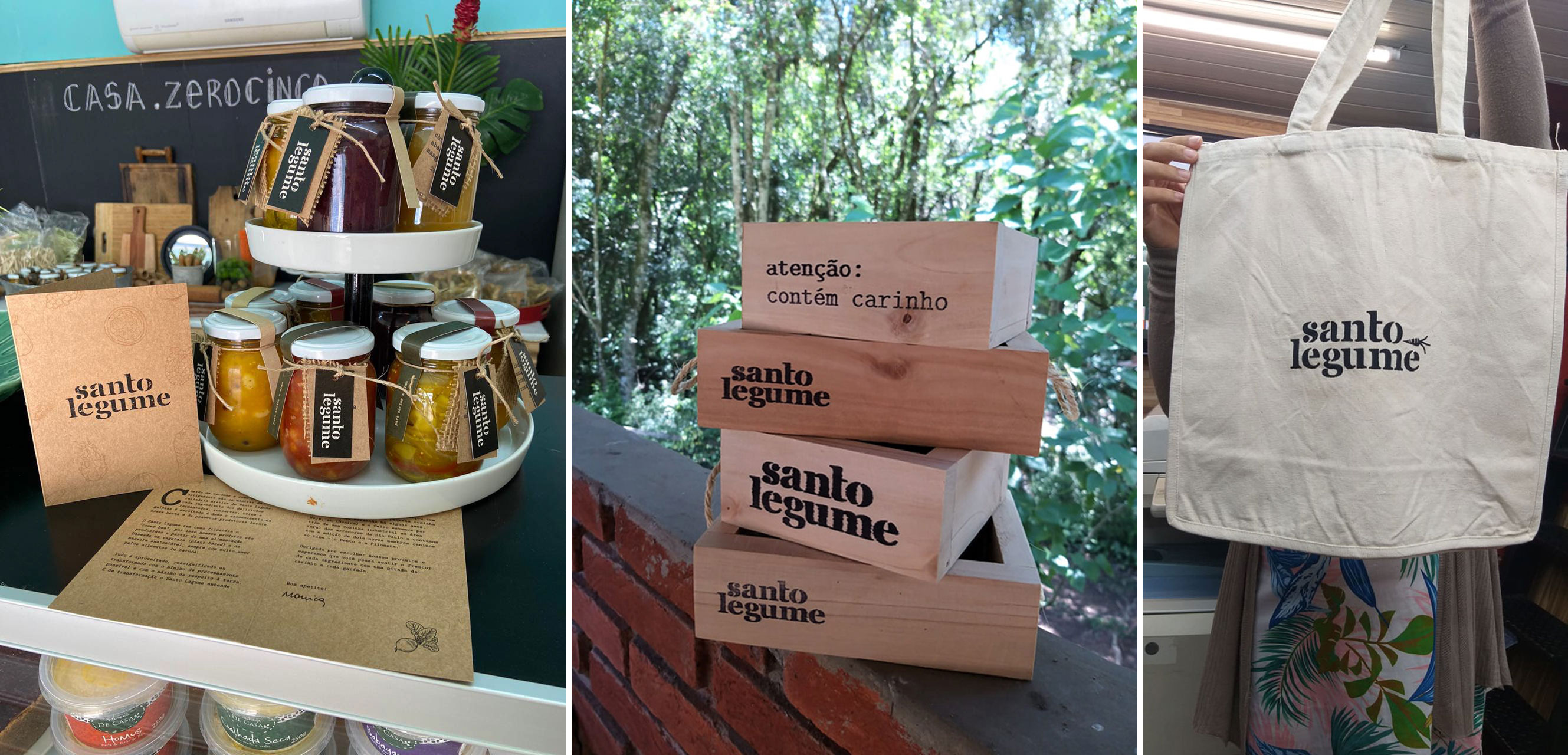
This project contemplated a logo design, a graphic pattern, a visual identity manual, packaging, web design, social media design, print collateral (business card and bi-fold brochure), and the creation of customized stamps.
The concepts of “homemade meals” and “comida de vó” or, in English, “grandma’s food” are the foundation of what makes this local business stand out and are reflected on its visual identity - from the heart-warming earthy "real food" color palette to the retro and authentic vibe of a typewriter font.
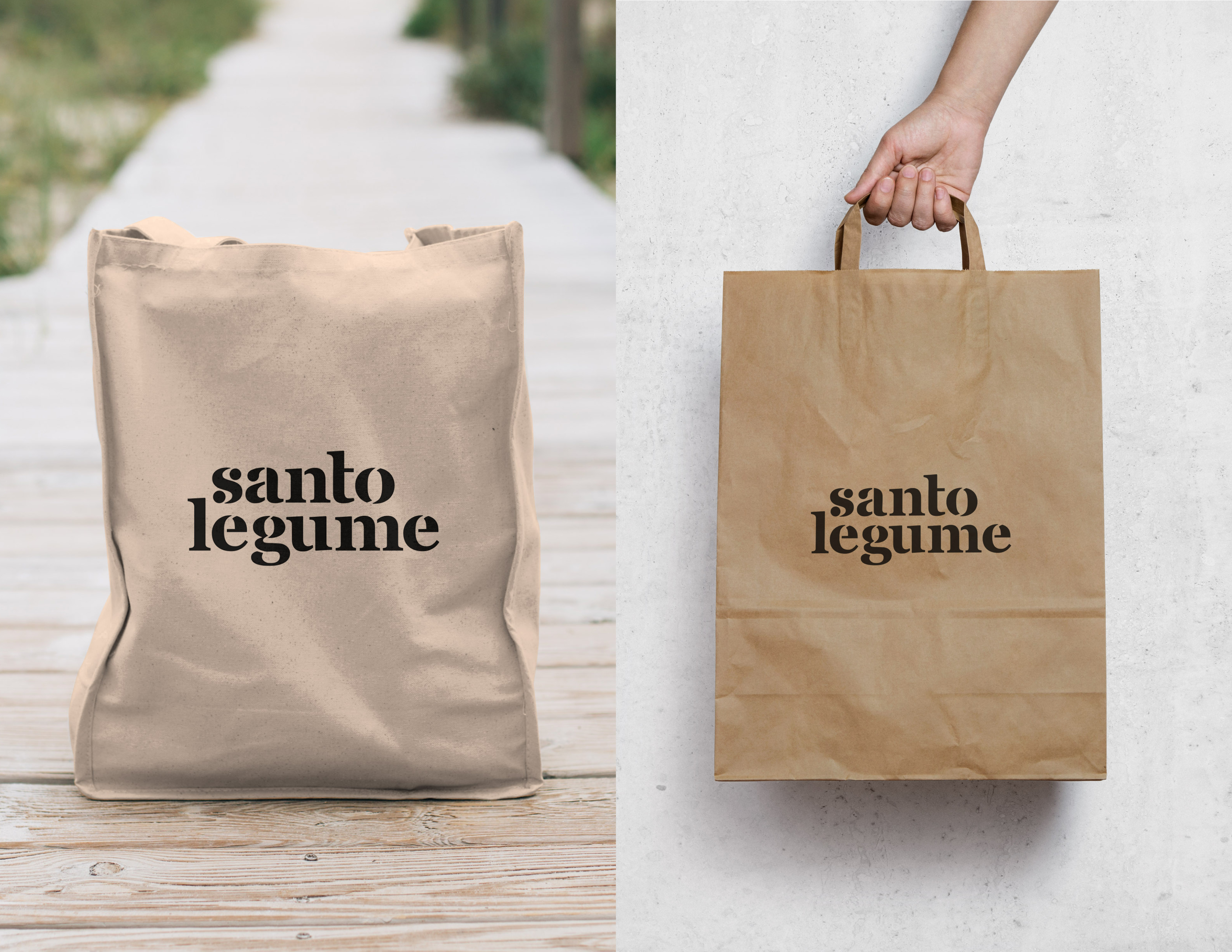
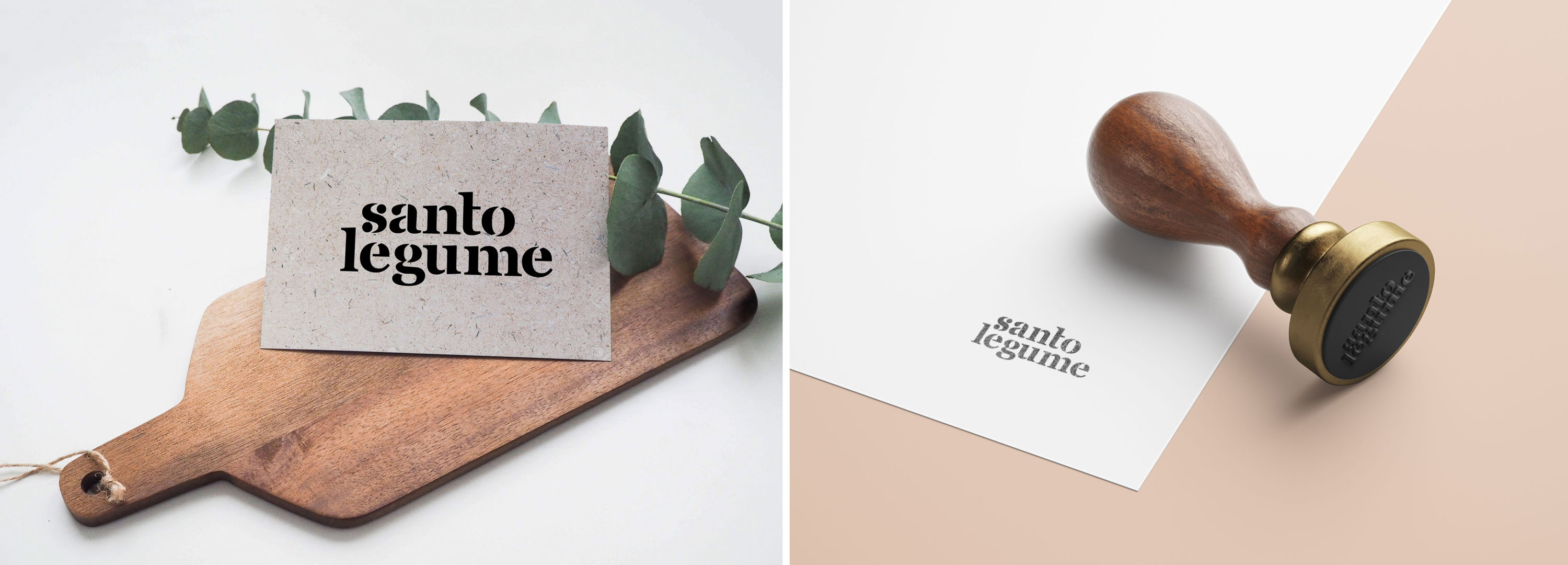
The choice of a typographic logo using the Saint George lowercase stencil font goes along with the idea of conceiving a more vernacular visual identity. Placing each word in superposition gives movement to the logo and brings up the image of a typewriter. Besides that, the use of a font that resembles a stencil / typewriter goes back to the idea of ancestry evoking time spent in the kitchen with loved ones cooking quality meals like the old times.
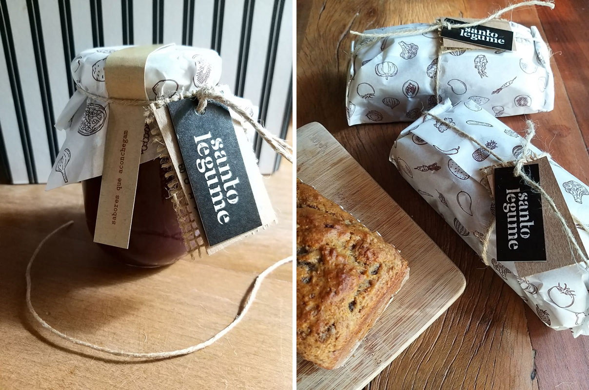
The stamps use the logo design and communicate that just as each homemade product is unique, each packaging manually stamped with the business logo will always be different.

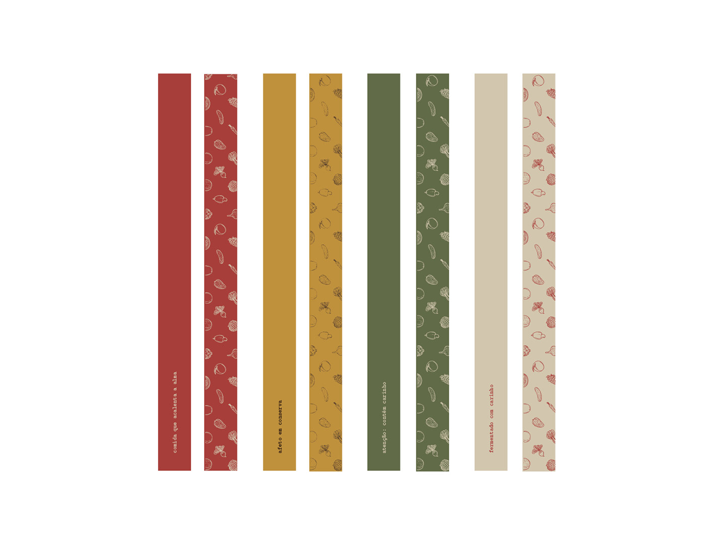
The color palette highlights the illustrations included in the visual identity and contains autumnal colors. These illustrations represent ingredients found in many of Santo Legume’s recipes, and the inspiration for the colours is also a reflection of experiencing autumn during my creative process.
The relevance of the season and its relationship with the color palette portrays how much of this small business values align with my own: that of a vegan diet, in-natura food, less is more, minimal waste and minimal impact.
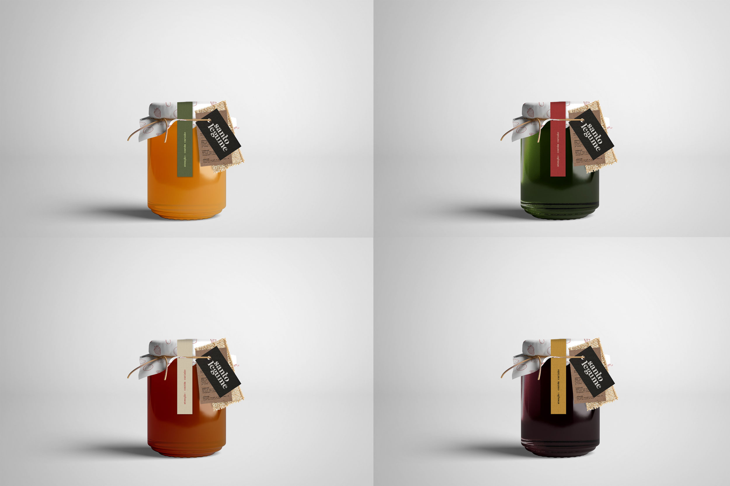

As for the design of the packaging, nature-related colors remind us of the sustainable source of Santo Legume’s homemade products, complemented by the choice of biodegradable packaging made of recycled paper and natural materials such as juta, or jute. Monica and I worked together to create optimal waste-free packaging sizes, dimensions and formats that would allow her to have autonomy over the printing process.
The project also included nutritional information designed in Latin modern mono font as well as labels which embrace the preserves with short sayings reminding customers of the values of love, coziness and grandma’s affectionate cooking.